Overview
A widget-first banking dashboard for financial cognition
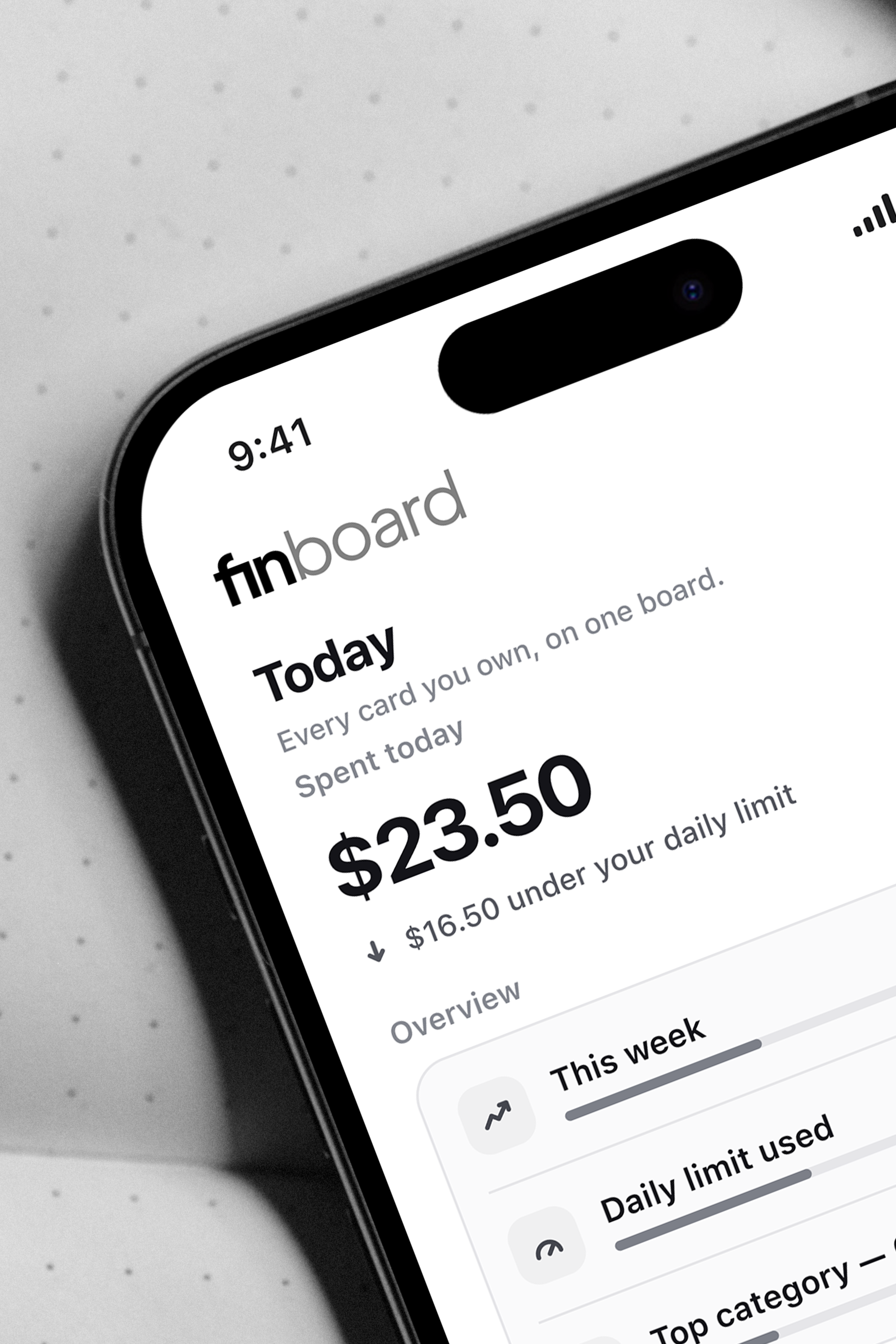
finboard is an iOS-native app that lets early-career adults read their own spending at a glance.
As payments go cashless, the felt sense of spending money fades, and budgeting apps that are good at collecting data rarely turn it into self-understanding. finboard reframes spending as something to explore rather than track, and puts it where this group already looks, on the Home Screen, the Lock Screen, and the Dynamic Island. I treated native widgets as new interaction points and designed them to optimize financial cognition, so a person can understand their money without opening an app or logging in.
Discovery
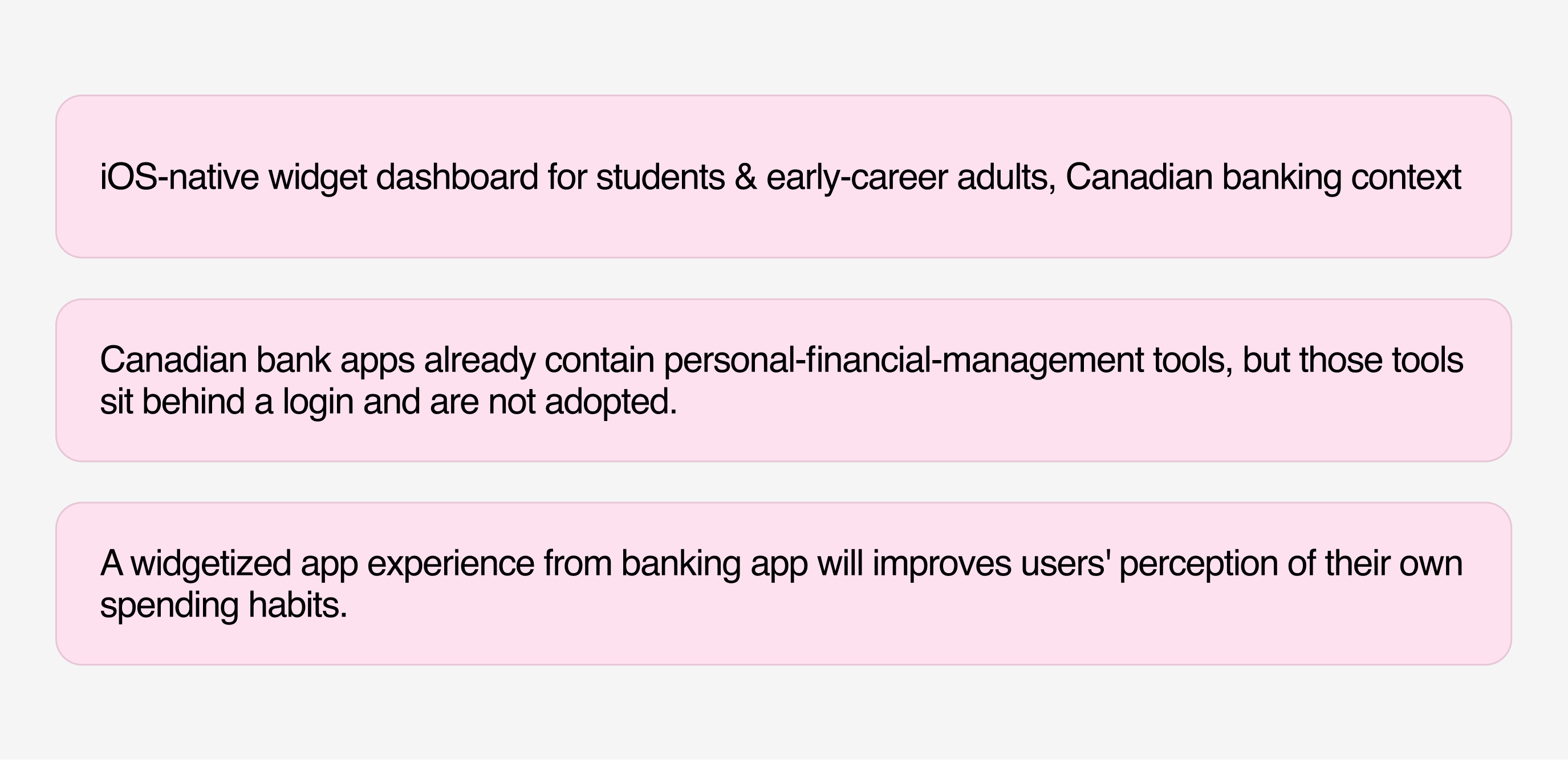
I opened the research by fixing the target and the bet. finboard would be an iOS-native widget dashboard for students and early-career adults in the Canadian banking context, and the working hypothesis was that surfacing bank data as a widget, outside the login, would improve how people see their own spending.
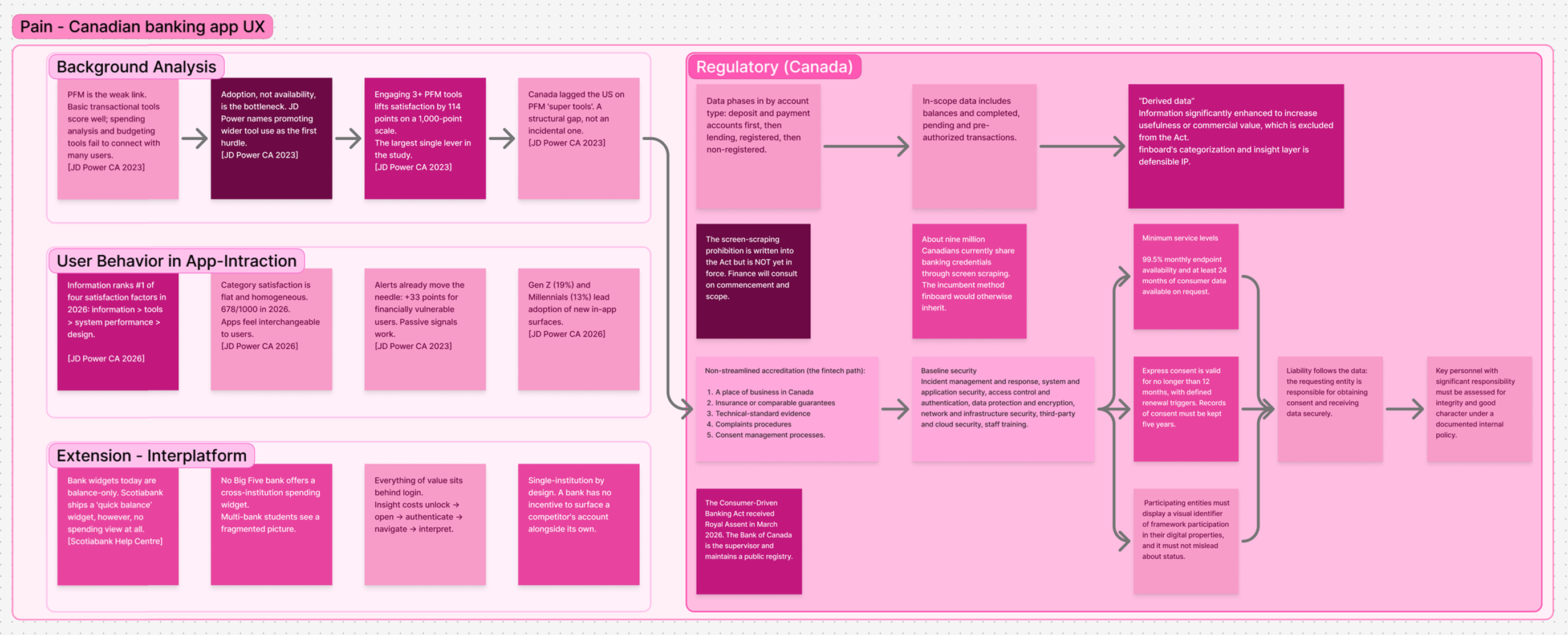
From there I mapped the pain across three fronts at once, the market, in-app behavior, and Canada's banking rules. It showed me that the weak link is not the tools themselves but their adoption, and that the incoming Consumer-Driven Banking Act shapes what a cross-institution product is allowed to do.
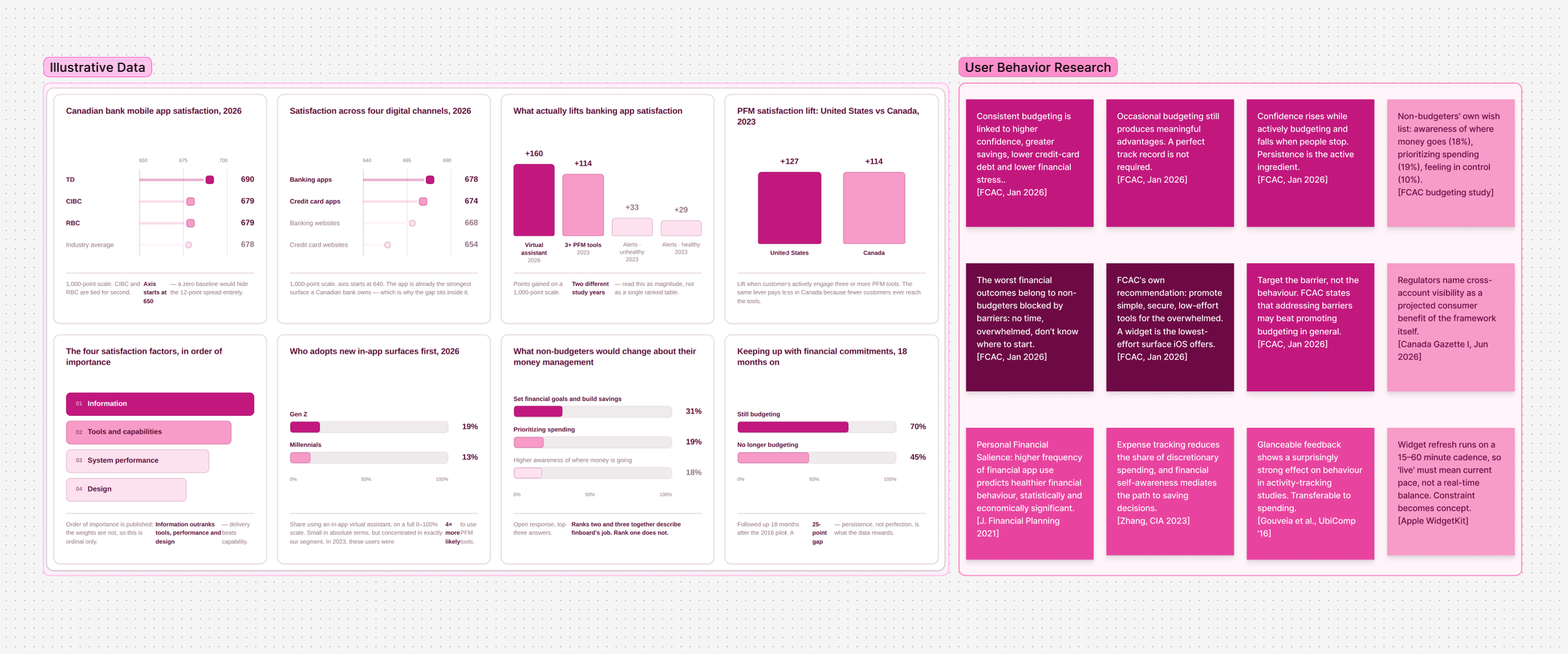
I grounded the direction in data and existing behavioral research, reading what actually lifts app satisfaction, who adopts new in-app surfaces first, and how glanceable feedback changes spending. One pattern held throughout: information beats features, and the users who struggle most gain the most from low-effort, always-visible cues.
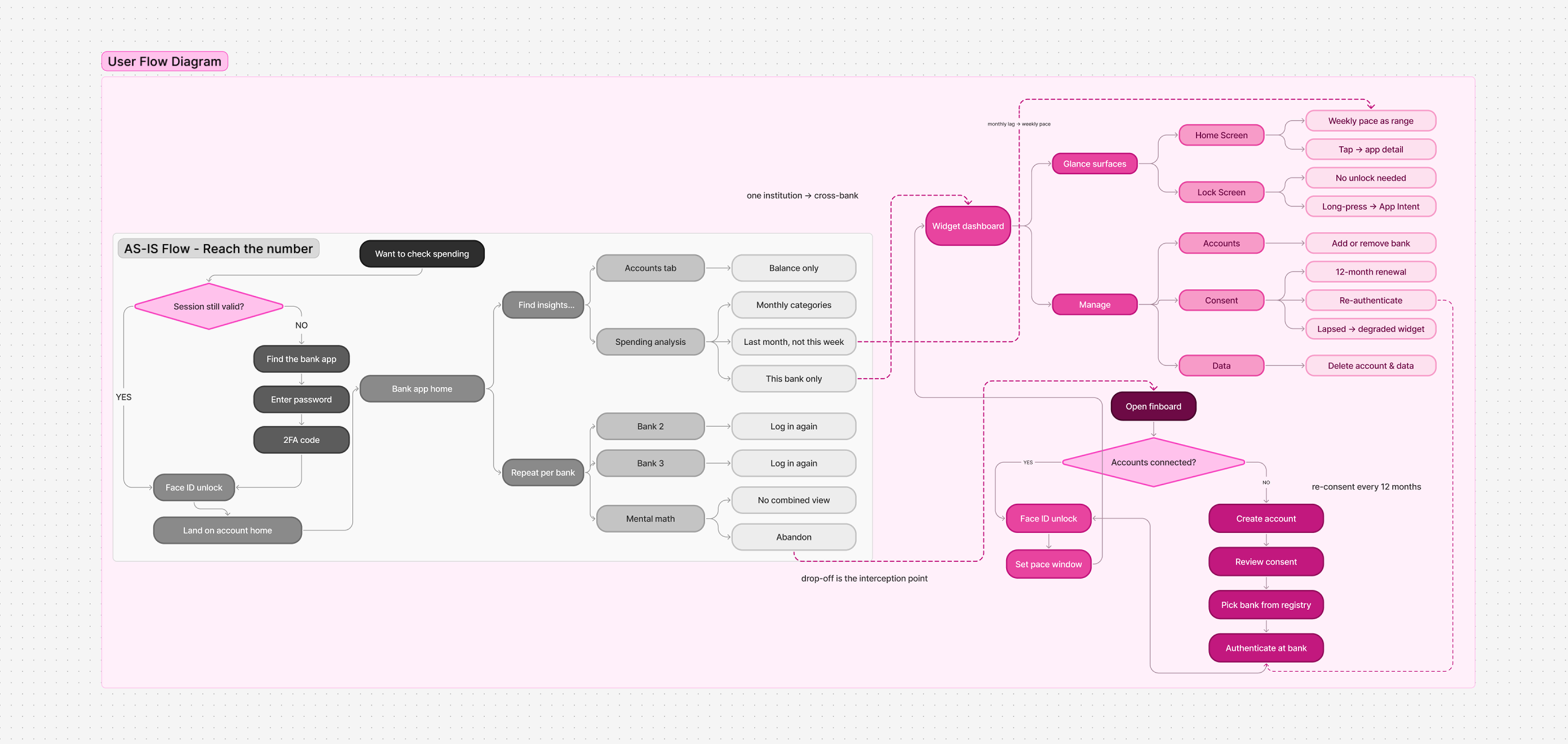
Then I redrew the flow. Today, checking your spending means logging into each bank, digging past a balance-only view, and doing the math yourself, and most people drop off along the way. finboard intercepts that drop-off point and replaces the whole routine with a glanceable widget backed by a single consent-based connection.
Prototyping
I prototyped in two passes, first to settle the structure, then to make it feel like a real iOS product.
Low-fidelity Prototype
Three boards, each wireframed beside the flow that drives it, so the structure could be argued about before any visual style existed.
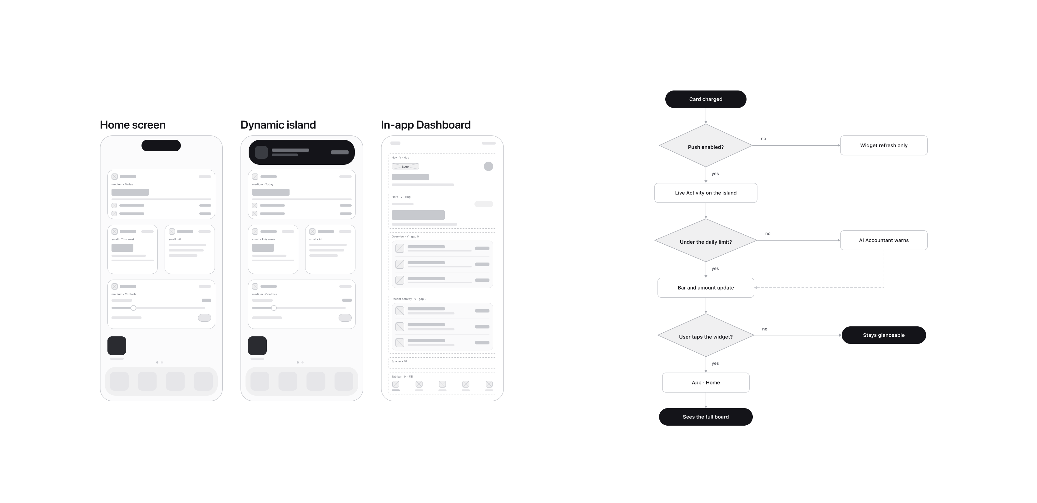
Home Screen, Dynamic Island, in-app dashboard. I projected the app onto the surfaces iOS already provides, building the wireframes out of native components rather than inventing a shell, so the first pass could be judged as an iOS product instead of as a picture of one. The flow beside it is a prediction of what the person does next. A card is charged, the island carries a Live Activity if push is on and the widget simply refreshes if it is not, and the daily limit decides whether the AI Accountant says anything at all. Whether they tap through is the branch that mattered most to me, because staying glanceable has to count as a successful outcome rather than a drop-off.
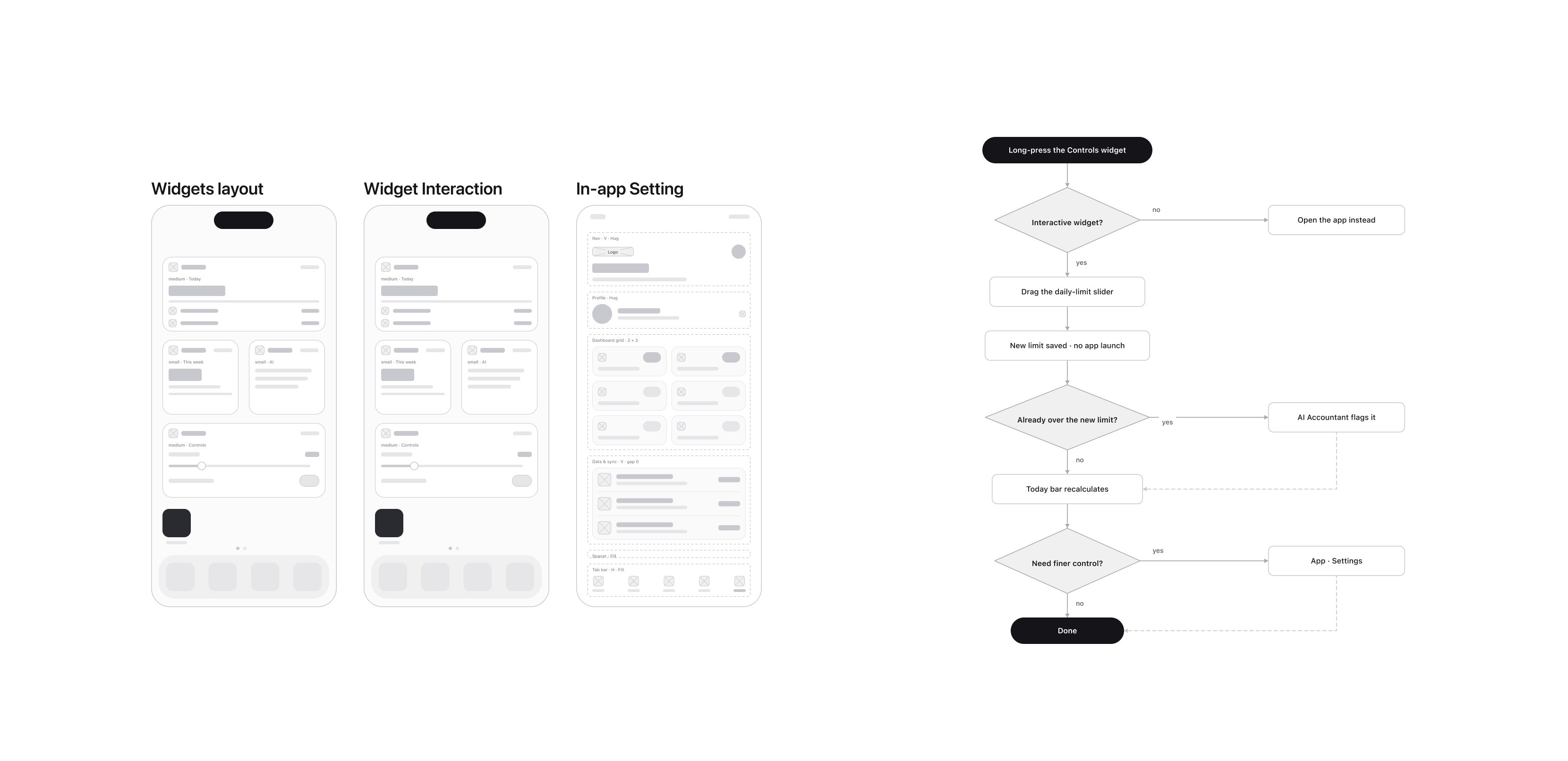
Widget layout and widget interaction. This board is about what a person can do to the widget without leaving the Home Screen. Long-pressing the Controls widget opens the daily-limit slider in place, the new limit saves with no app launch, and the Today bar recalculates on the spot. I drew the over-limit case as its own branch, since setting a limit you have already passed is exactly the moment the widget has to say so rather than accept it quietly. Only finer control hands you off to Settings, which keeps the app as the exception and not the default.
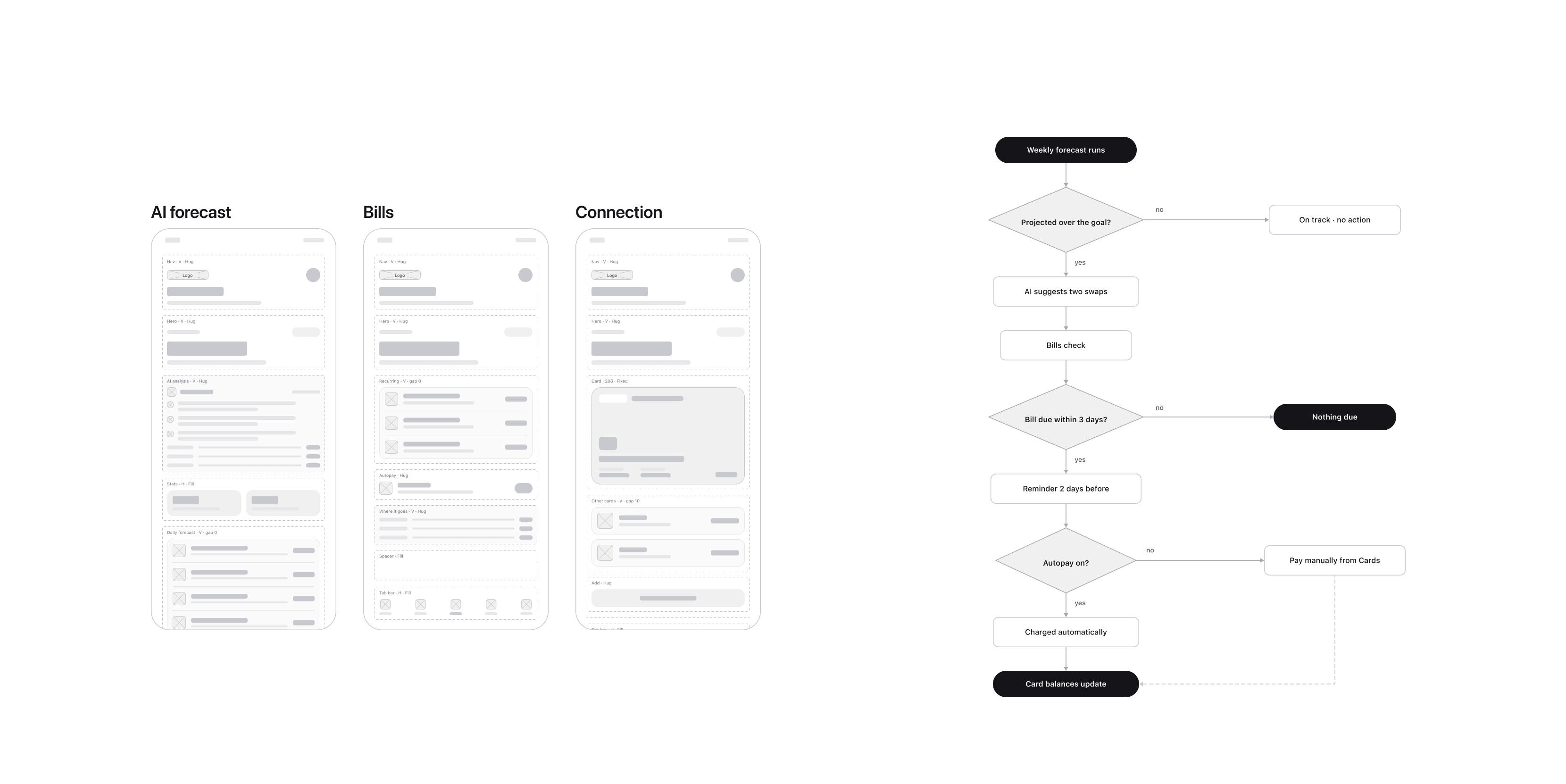
AI forecast, Bills, and Connection. These are the in-app screens, and the flow shows how they feed back into the widget rather than replacing it. The weekly forecast runs, two swaps are suggested if you are projected over the goal, bills are checked, a reminder fires two days ahead, and autopay decides whether the charge happens for you or gets handed to Cards. Every path ends at card balances updating, which is the number the widget reads. That loop is the whole relationship: the app does the work and the widget is where you see the result.
High-fidelity Prototype
Four boards, moving from the component set to the surfaces, then to the widget itself, and finally to the setup that has to happen before any of it works.
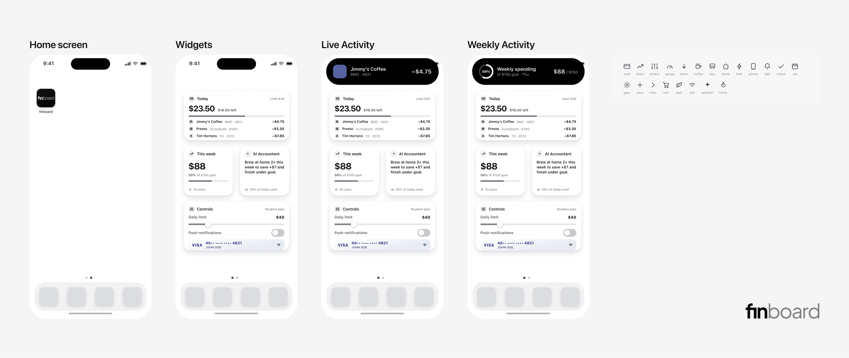
This pass is where the components got built. I drew the icon set, the type, and the card shapes as a library first, then used them to visualize the interactions the low-fidelity flows had already confirmed. Home Screen, the widget stack, the Live Activity for a single charge, and the weekly ring on the island are the same four moments from the earlier diagram, now at the fidelity a person would actually see. Working from a fixed component set is what kept the four surfaces consistent without redrawing anything, so I could judge them side by side instead of one at a time.
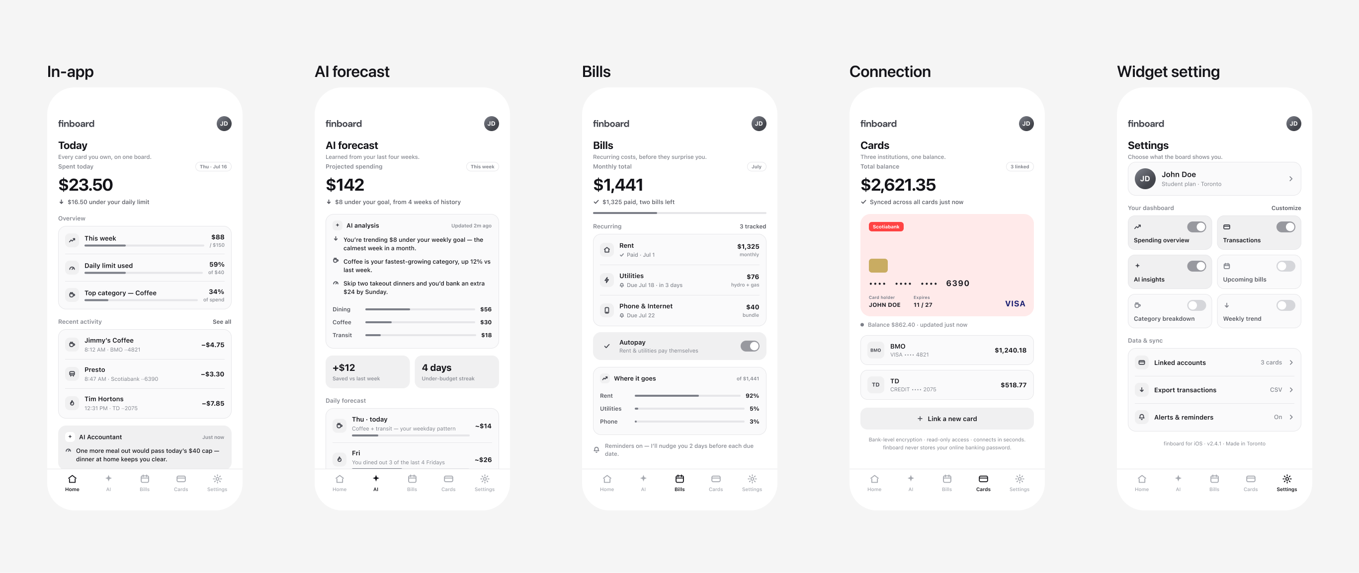
In-app is where I made the interaction concrete, and the work was less about layout than about deciding which elements and which words earned a place on each screen. Doing that changed the feature priority. Because the widget is the product, cutting complexity out of the app came first rather than last, and what survived is only what the widget cannot do: four weeks of forecast history, recurring bills and autopay, linked cards and balances, and the settings that decide what the board shows you. Every screen here exists to cover a gap in the glance, not to compete with it.
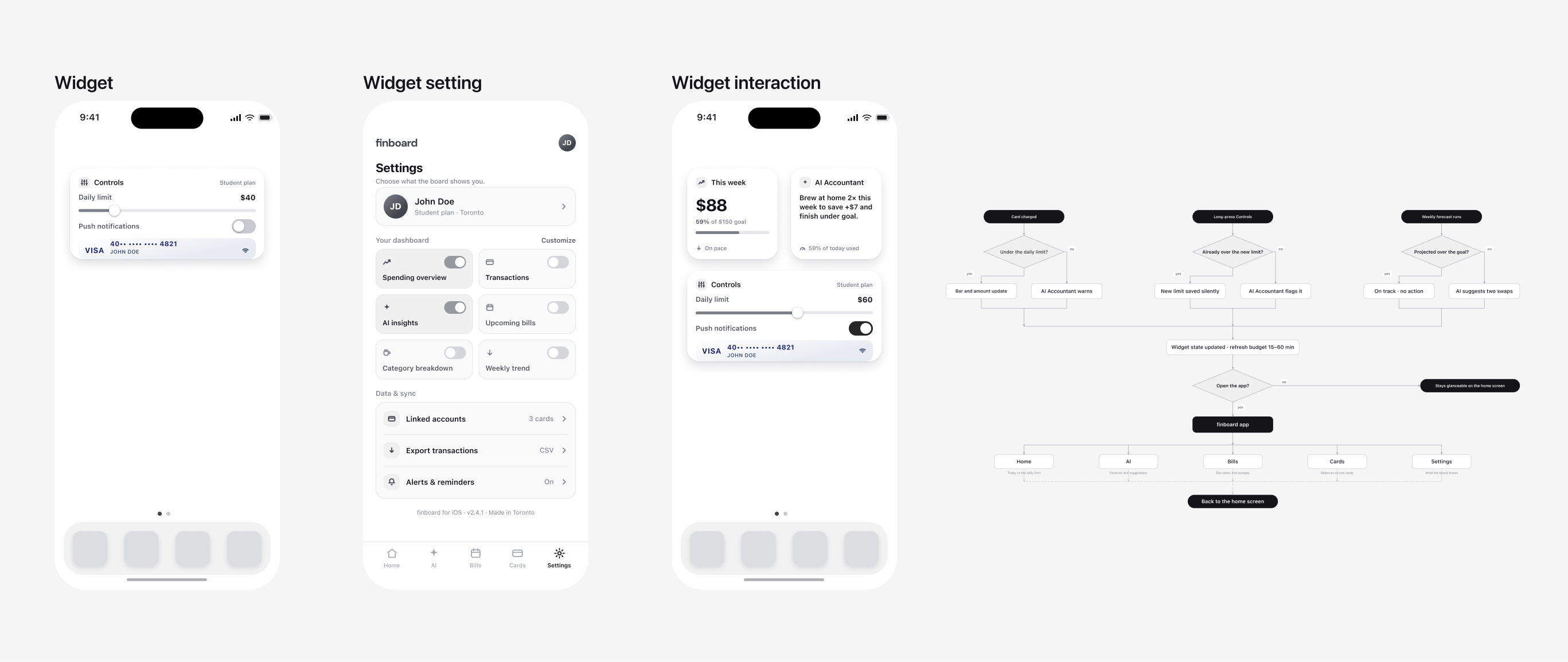
This is the widget interaction, and it is the board that mattered most. I worked it from two directions at once: how much say the person gets over which financial information reaches them, and how far the widget control can be simplified before it stops being useful. Controlling the widget from inside the user's own flow is what puts them in charge of the feed, so the daily limit, the notifications, and the dashboard toggles are all reachable without the app becoming the destination. The map on the right folds the three earlier journeys into one, and every branch resolves to a widget state refreshed within fifteen to sixty minutes, with opening the app kept optional.
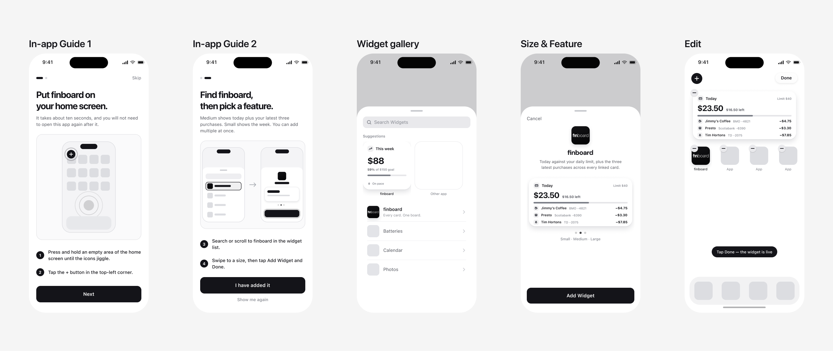
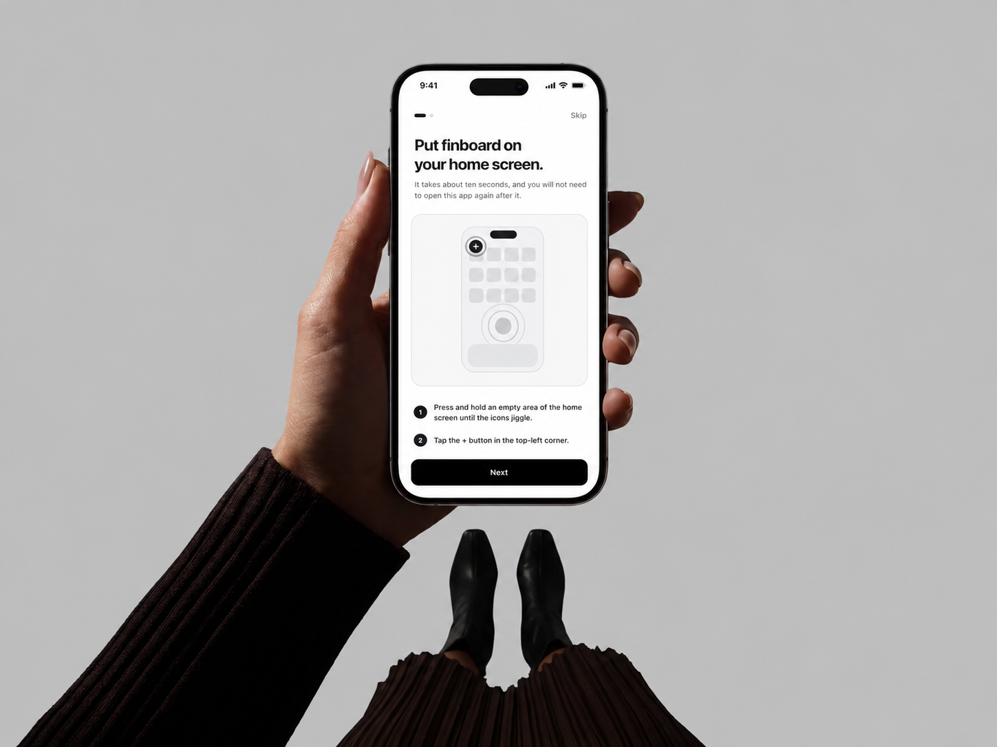
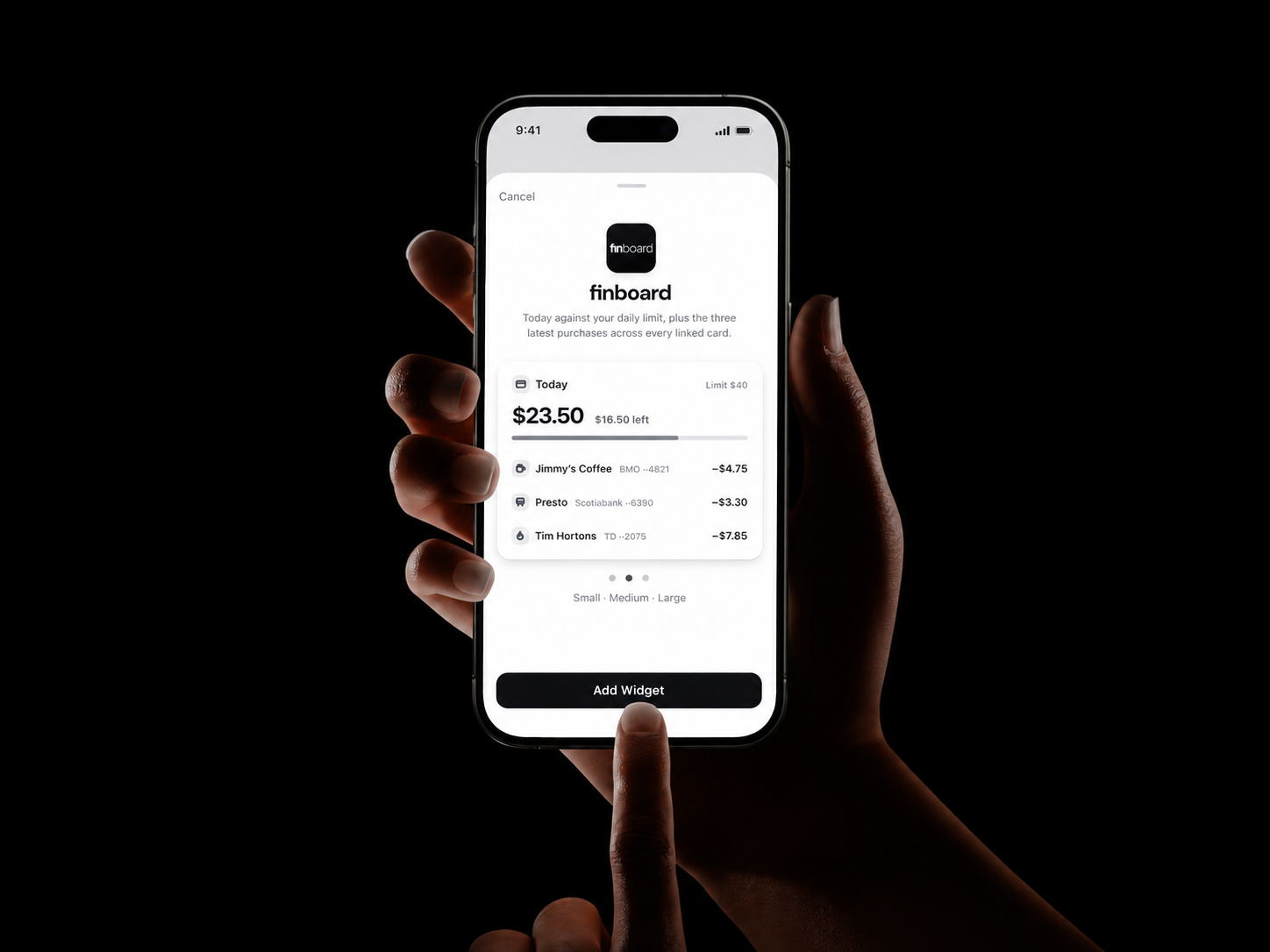
None of the above happens on its own. Right after the download, a person has to get the widget onto their Home Screen and choose what it is allowed to show, and iOS gives no help with that. So I treated the initial setup as an onboarding phase in its own right rather than as a settings screen. Two guide cards walk through the press and hold, the plus button, finding finboard in the widget list, and picking a size, then hand off to the system gallery and come back with the widget live.
I wrote the guide to be skippable and repeatable, with I have added it next to Show me again, because the one thing I could not do was block the product behind a setup step. Ten seconds, stated up front, and the promise that you will not need to open the app again after it. For a widget-first product this phase is not an accessory to the design, it is where the design either survives first contact with a real user or does not.
Widget
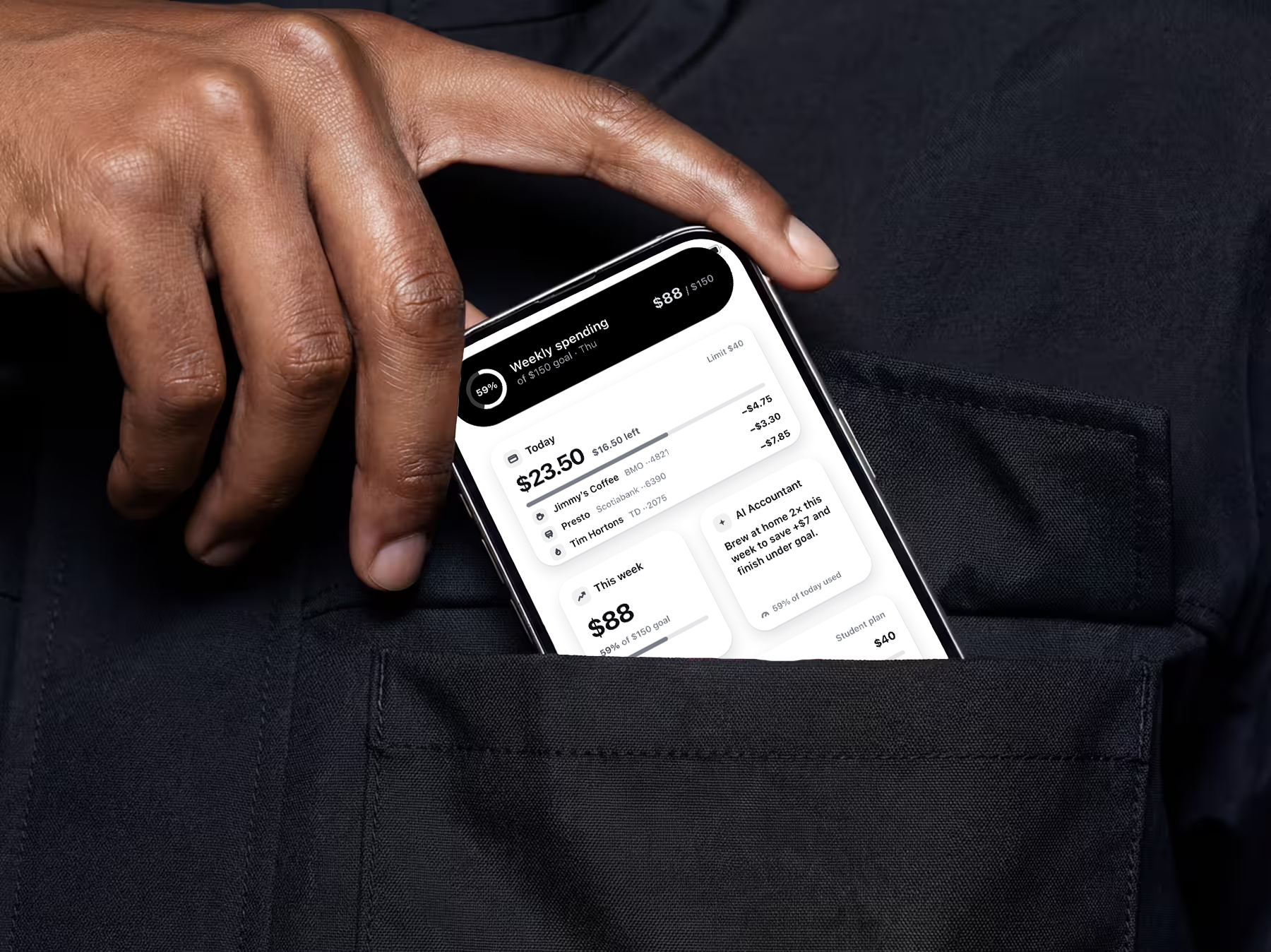
The widgets update on their own on the Home Screen, so one glance is enough to read the day's spending, the weekly pace, and the AI note, without opening the app.
Widget Controls
The controls widget is interactive on the Home Screen itself. A person sets the daily limit and toggles alerts in place, so the widget is a surface to act on, not only to read.
In-app
The widget is the main surface, so the app is deliberately not. It picks up only what a widget cannot do, the account syncing and the functional depth that needs a full screen, across Home, AI Forecast, Bills, Cards, and Settings. It supports the glance rather than replacing it.
Design Audit
WCAG 2.2 AA
I took the finished screens back into Figma and measured every layer against WCAG 2.2 AA, instead of judging the contrast by eye.
A redesign only counts if it could actually ship, so the question I wanted answered was whether these screens hold up as an accessible product rather than as a portfolio image. WCAG 2.2 AA gave me a frame to test that against. It turns "is this grey readable" into a number I either meet or I do not, and it is the standard the work would be held to in practice anyway.
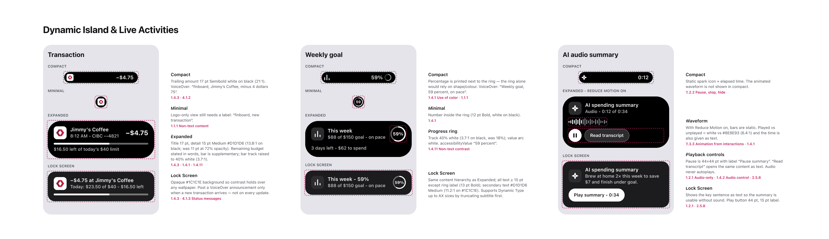
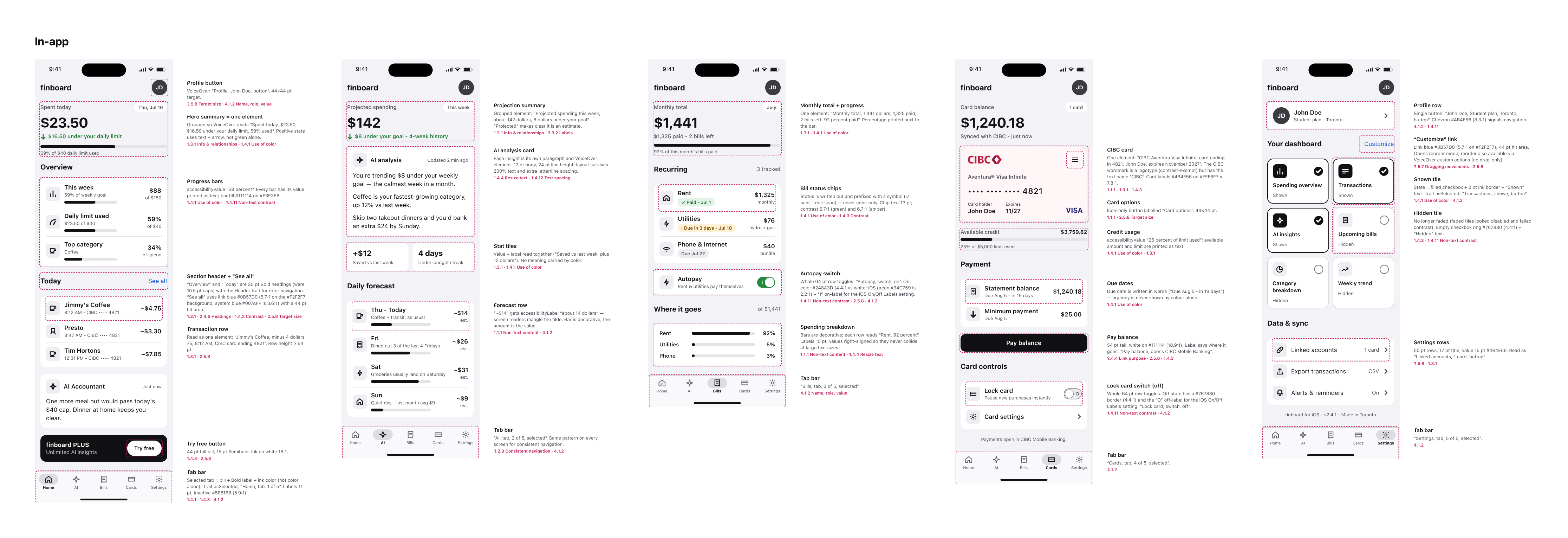
What I missed
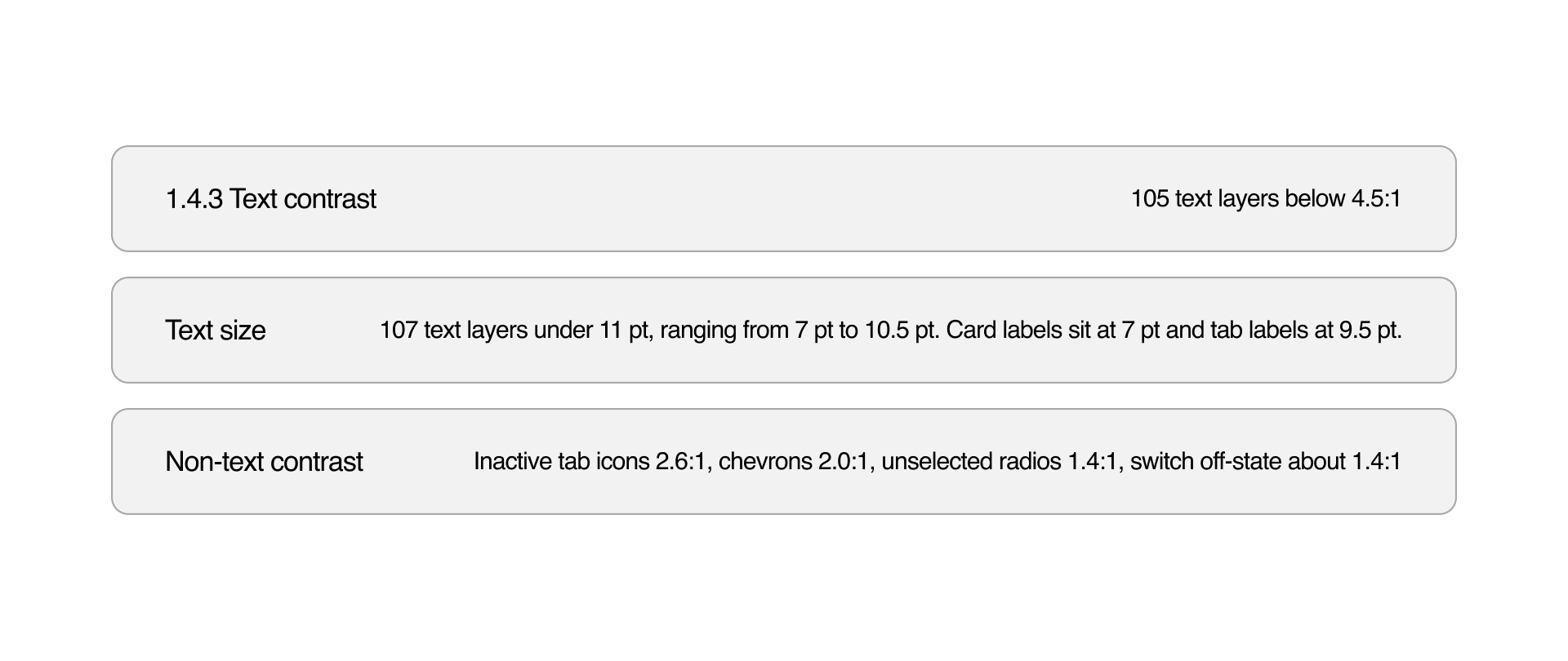
* Automated check run in Figma on all 8 redesigned screens and stages: 224 text layers, 83 icons and shapes, 104 named interactive layers. Contrast is the WCAG relative luminance of each layer against its flattened parent background. Thresholds: text 4.5:1 (3:1 for large), non-text 3:1, touch targets 44 pt (Apple HIG; the WCAG 2.5.8 AA minimum is 24 pt).
After the audit
Visual corrections and the interaction changes that came with them, made from an accessibility standpoint.
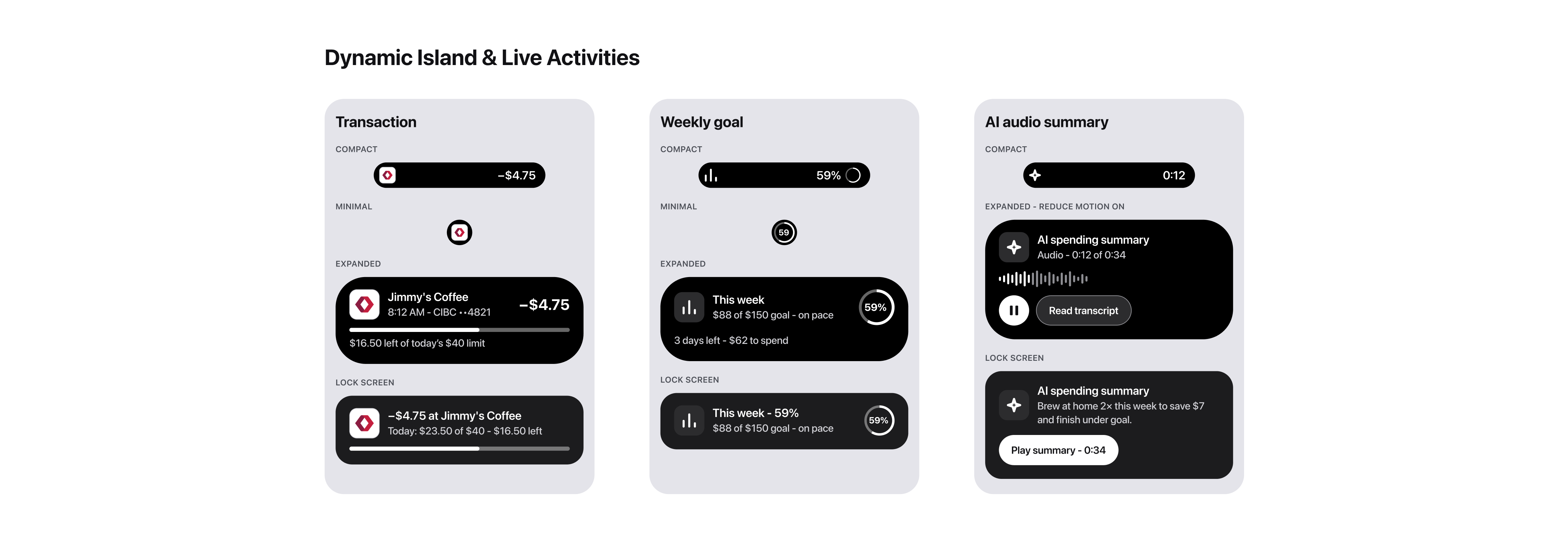
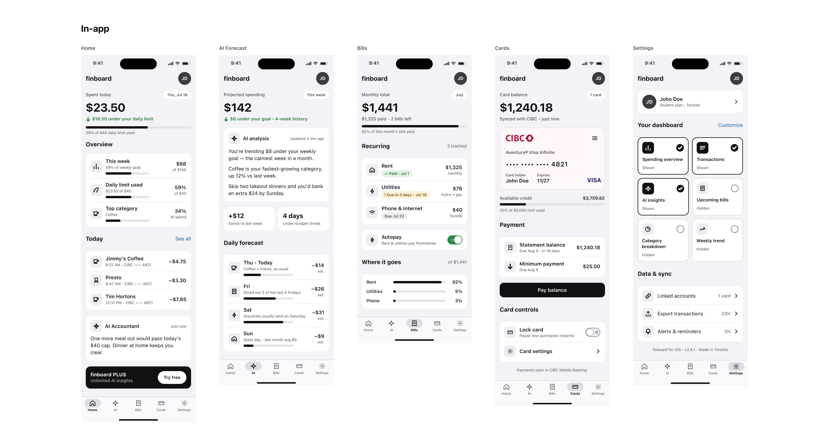
Fixing contrast changed the hierarchy, so this was a design pass and not a colour swap. Larger type means less fits on a widget, which forced a call on what actually earns the space. The screens came out simpler than my first version, and that is the part I would keep.
Conclusion
Human-centred design stays a claim until something makes it testable. WCAG 2.2 AA is what made it testable here.
finboard puts the whole product on a surface you look at for a second, so accessibility is not a layer over the design, it is the design. A number that cannot be read has not been delivered, whatever the layout is doing.
It is also consumer-facing, which means I do not get to pick the user base. It is whoever installs it, including the people the existing tools already lost. In a B2C product the accessibility floor is a condition of entry rather than a feature, and money is the wrong thing to lock people out of.
So WCAG 2.2 AA was the criterion I judged the work against, not a compliance pass bolted on at the end. Holding the redesign to it is what surfaced the misses above and forced the decisions that followed. Banking in Canada is federally regulated and moving into open banking, so whatever this grows into carries that obligation with it, and the standard only gets more binding, not less.