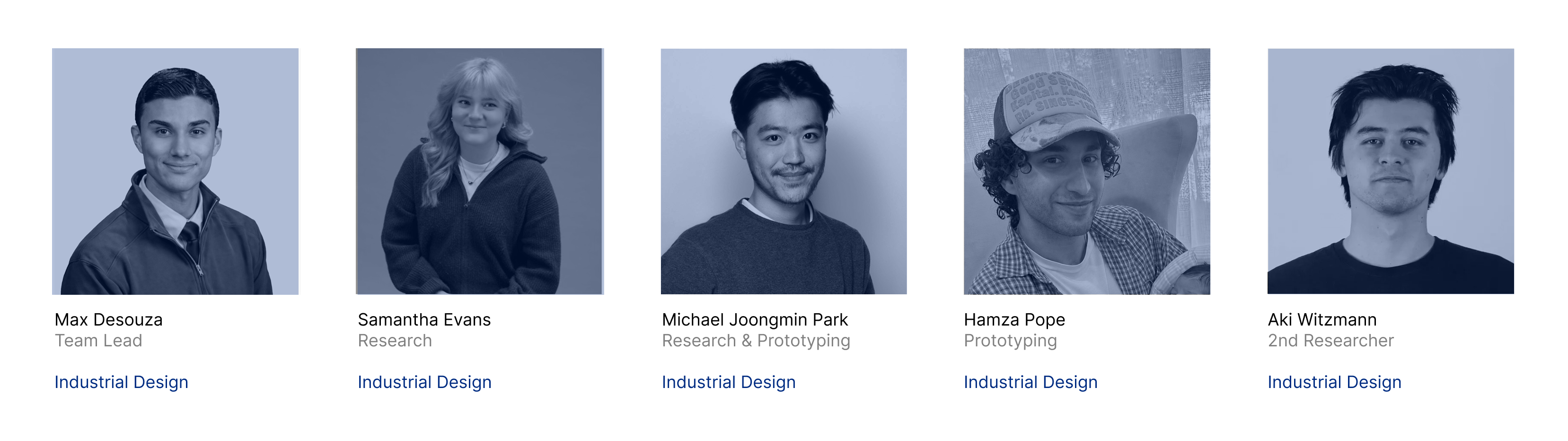
Meet the team
Overview
A mall you can only reach by car, asked to become a place
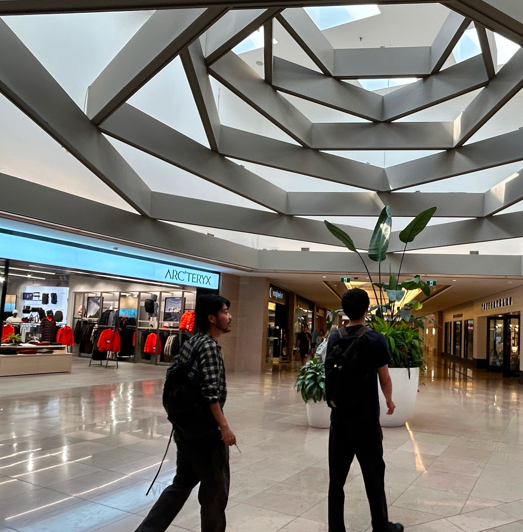
CF Sherway Gardens sits in Etobicoke at Highway 427 and the Gardiner, ringed on all sides by parking lots and arterial roads. The access that makes it work by car is the same thing that makes it unwelcoming on foot, and that contradiction is the project.
Cadillac Fairview is building three phases around the mall, so the user base shifts from commuter to resident over 7 to 15 years. My team and I worked on what the building has to become before they arrive. Research and prototyping were my part of it.
Snapshot
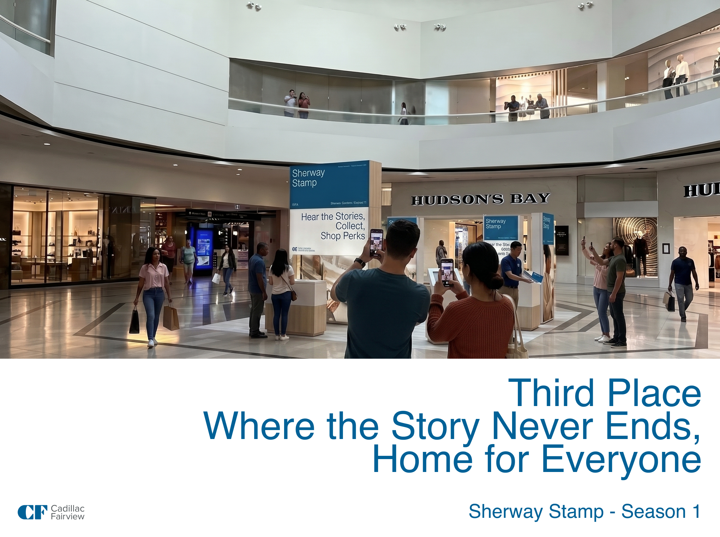
Scan the poster, hear the story, collect the stamp. The concept the research led to, before the reasoning behind it.
The challenge statement, the site, and the trend mix the direction had to sit inside.
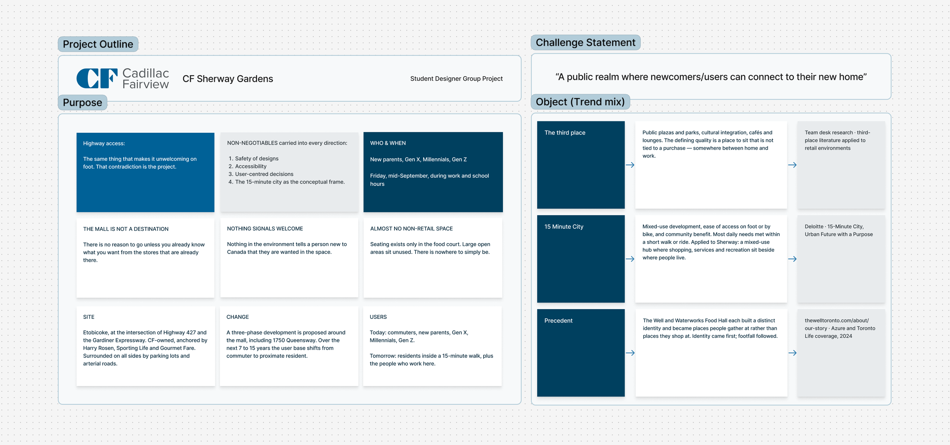
Our reference points were the third place and the 15-minute city, plus precedents like The Well and Waterworks Food Hall, both of which built an identity first and drew footfall second.
Problem Definition
The mall is legible as a shop and illegible as a place. There is no reason to go unless you already know what you want from the stores, which means every visit has to be justified by a purchase.
Three findings held across everything my team and I recorded on site, and they are physical rather than attitudinal.
What is actually wrong
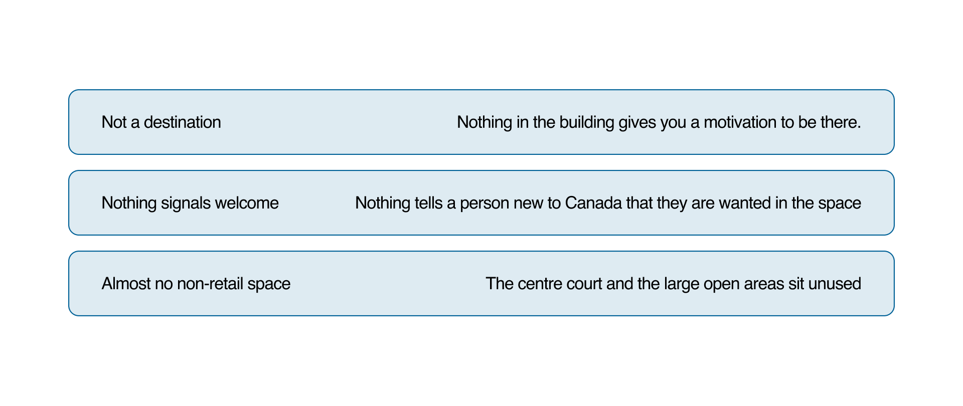
Every problem we found was physical, seating, orientation, unused floor area. So any proposal that does not change the space fails, no matter how good it sounds.
Discovery
Two phases, one to record the building as it behaves and one to hear how people describe it.
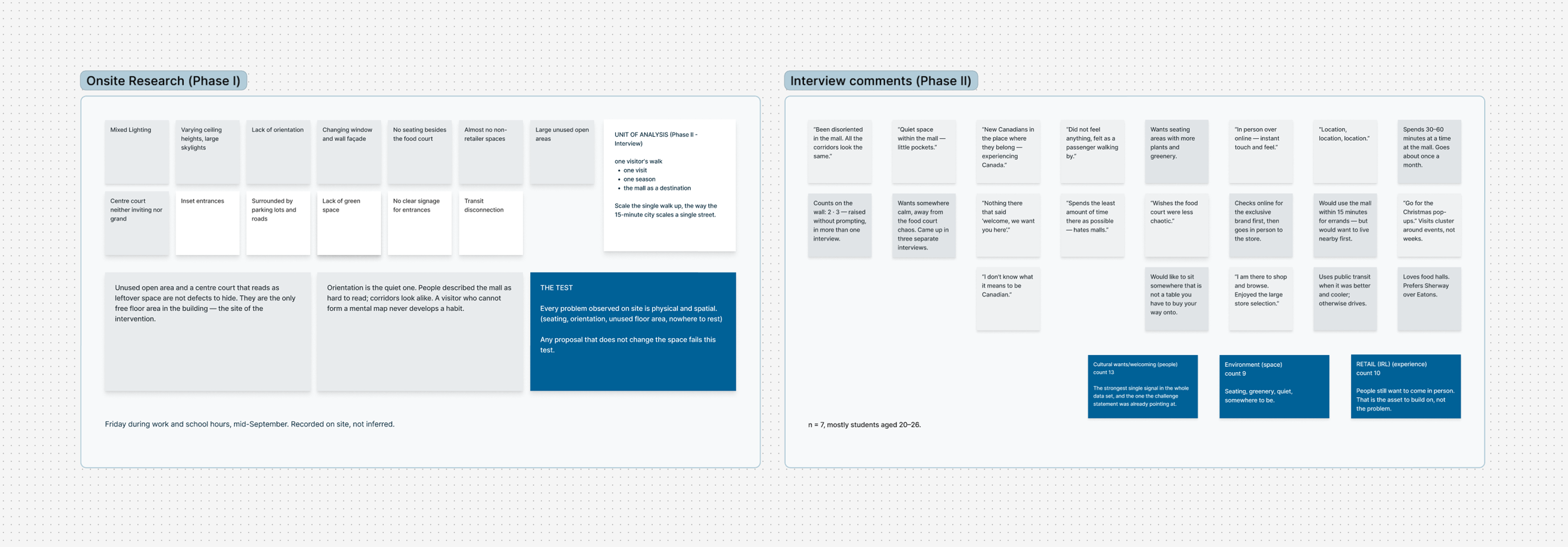
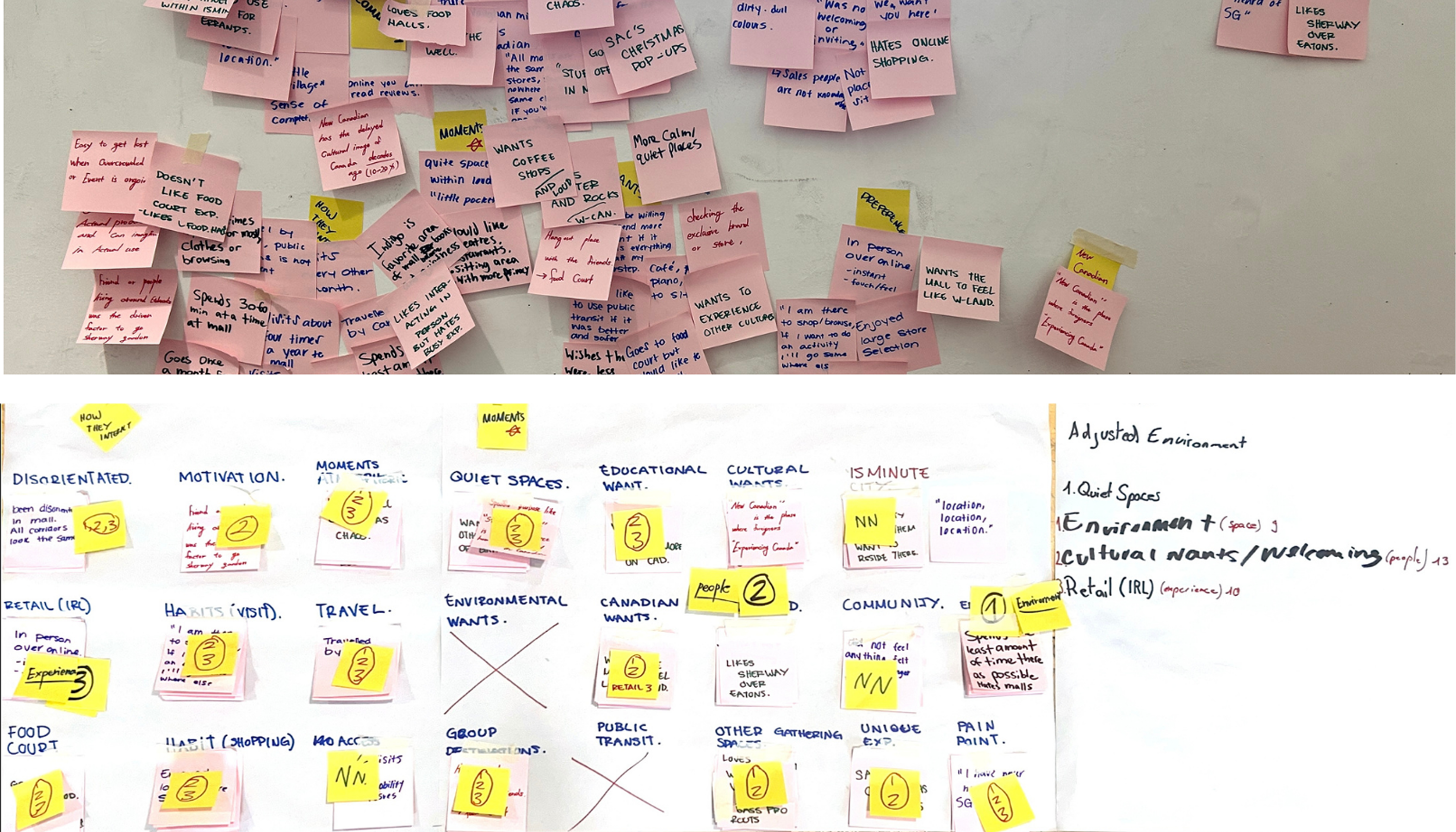
One walk through the mall on a weekday, then interviews with seven people. Orientation turned out to be the quiet problem: corridors look alike, and a visitor who cannot form a mental map never develops a habit.
Counting the signals rather than reading them settled our direction. Cultural wants and welcoming came up 13 times, wanting to shop in person 10. People still want to come in person, which meant the retail side was the asset to build on, not the problem.
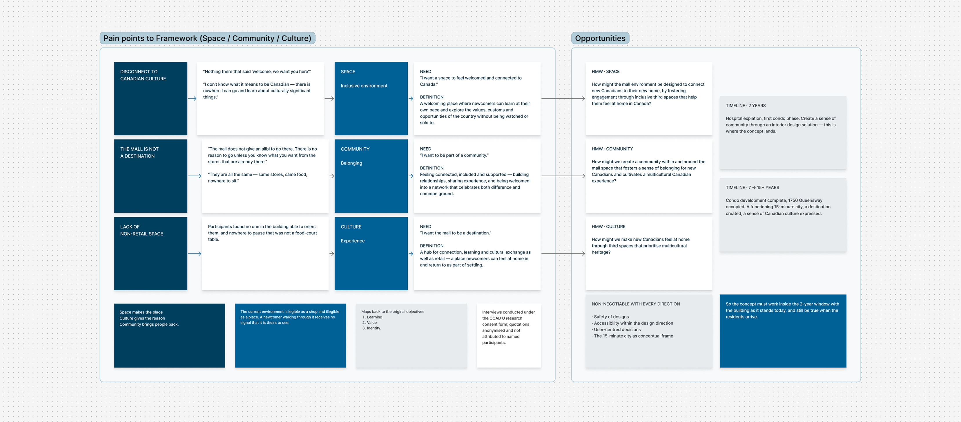
The pain points sorted into three needs. Space makes the place, culture gives the reason, community brings people back. The concept had to hold in the building as it stands today and in the one that exists once the condos are occupied.
Prototyping
Sherway Stamp
Commissioned posters through the mall's dead space, each one paired with seating, and a collection that carries across a season the way a membership does.
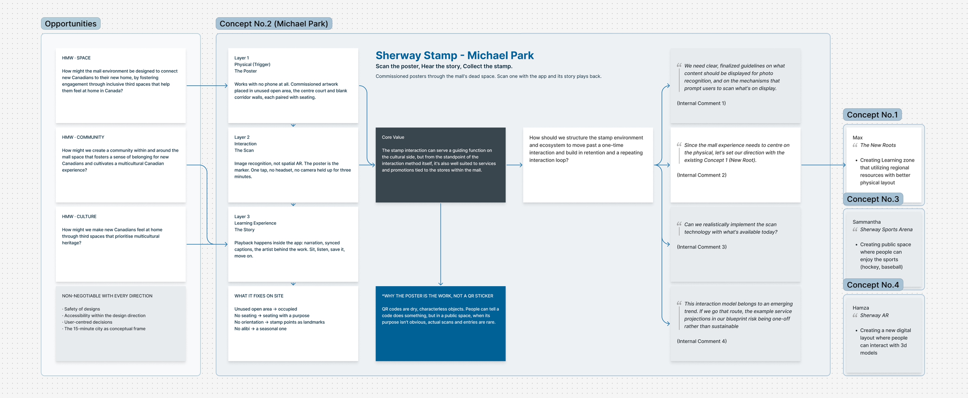
Three layers
A QR code is a characterless object, and in a public space people rarely scan one when its purpose is not obvious. Making the artwork the trigger means the intervention changes the room even for people who never scan anything.
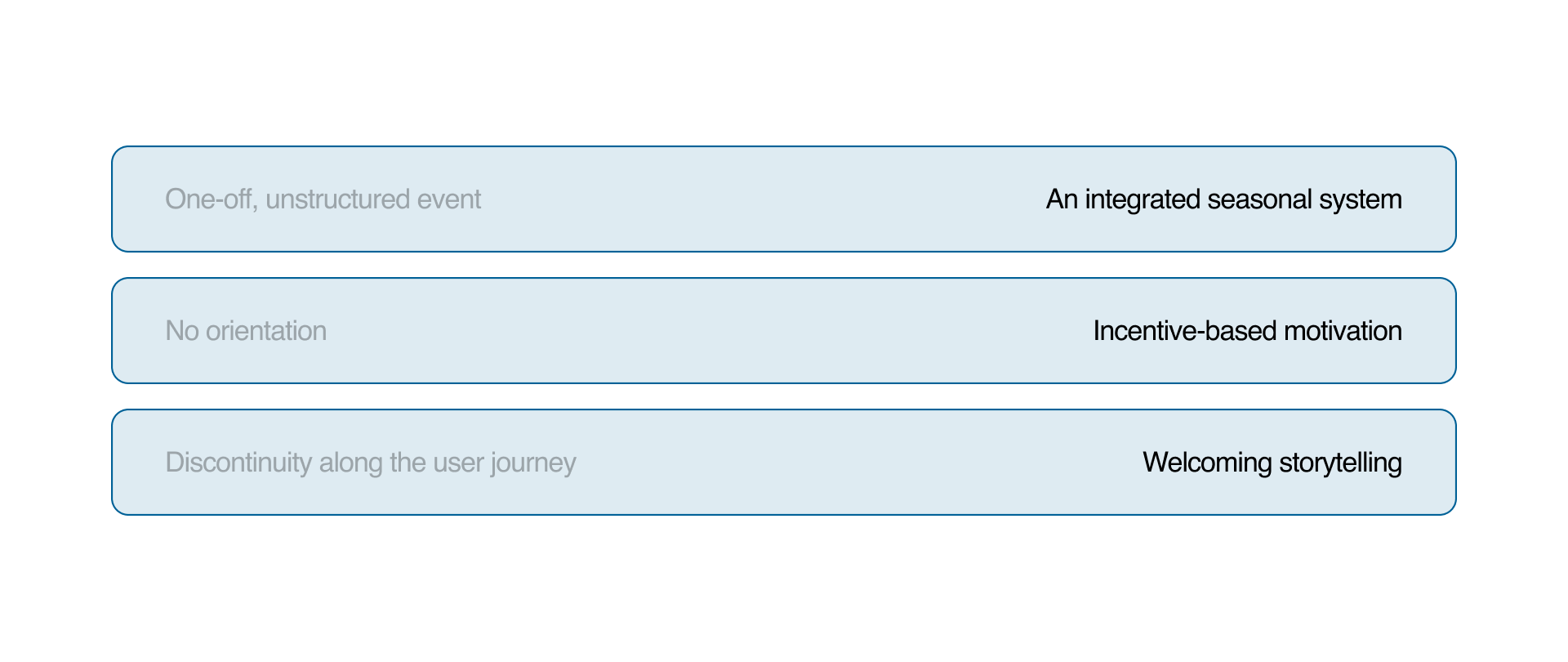
What it fixes on site
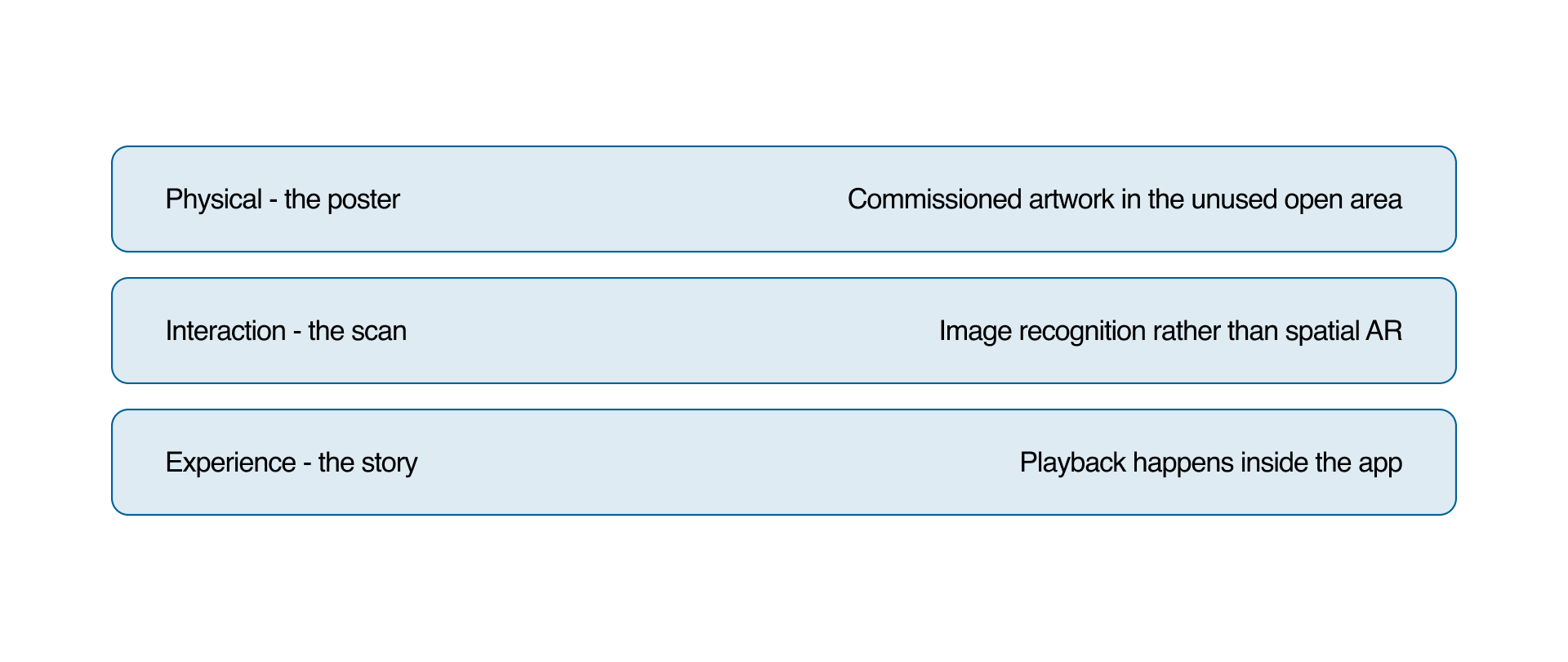
What I argued for was that the stamp sit on top of what Sherway already runs, its seasonal programming and its store promotions, rather than beside them. Folding those into one collection makes a visit accumulate the way a membership does, and gives the building something to draw people in with.
Low-fidelity Prototype
The in-app loop, then each screen set wireframed beside the flow that drives it.
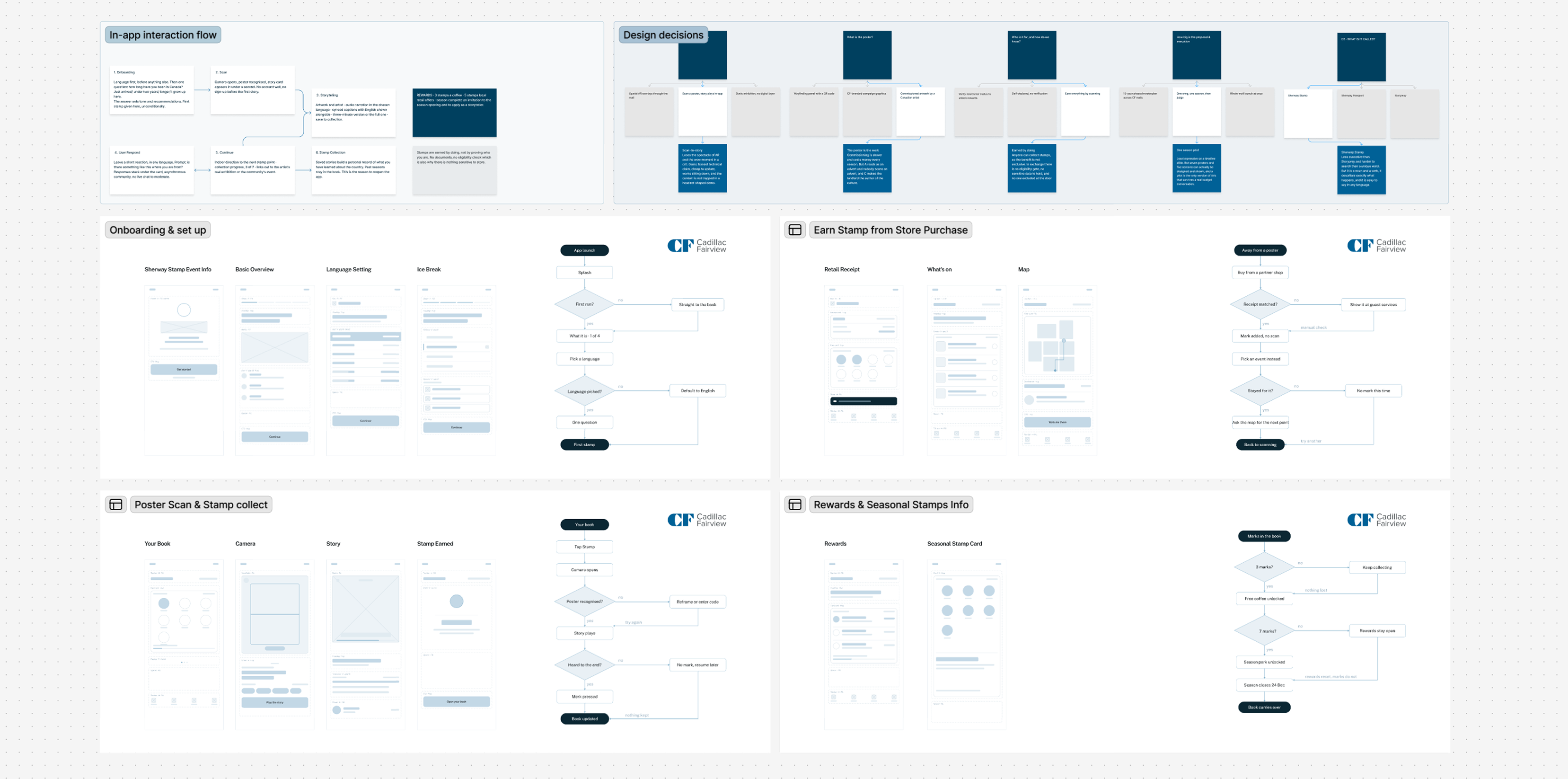
Drawing each flow as a decision tree rather than a screen list is what exposed the failure paths, and those are what decide whether this is a service or a demo.
The biggest thing we ruled out was scope: no spatial AR, no headset, no app-only content. The intervention still has to change the room for people who never open the app.
High-fidelity Prototype
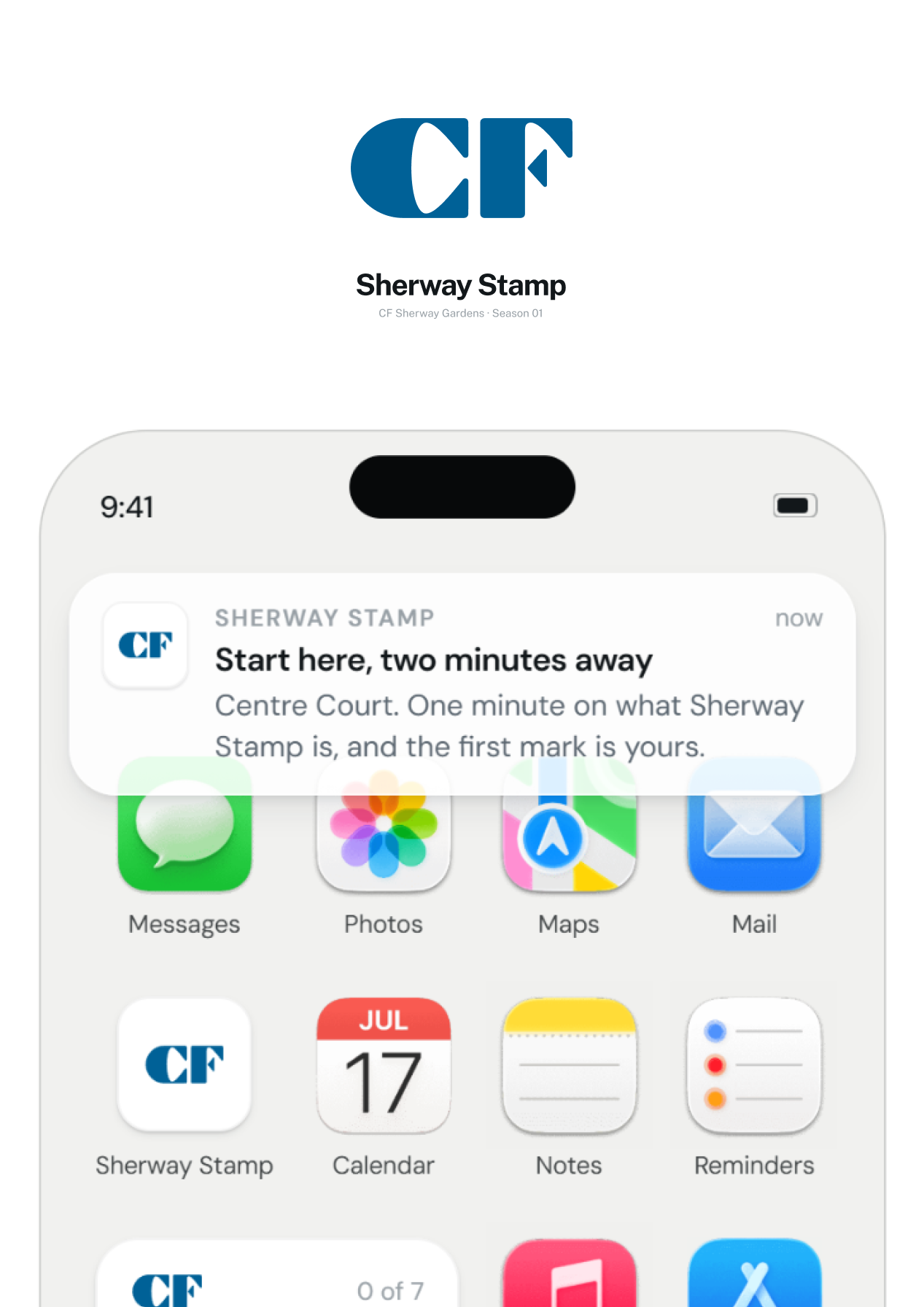
Three passes: getting the person in, running the core loop, and giving the season somewhere to go. Each one is the screen set first, then the same flow running.
Scan, listen, keep
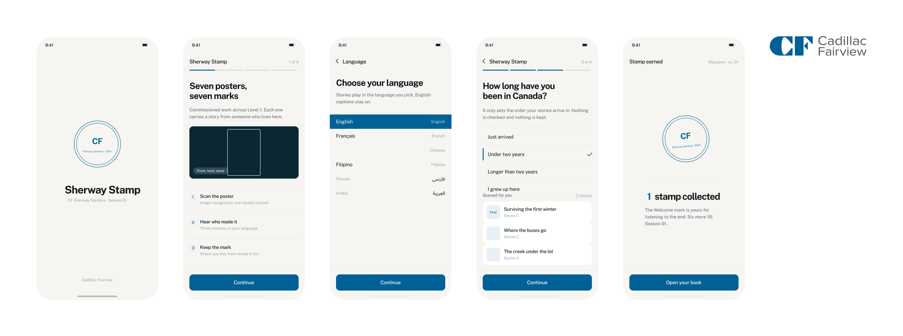
This is a service for people who are new here, so onboarding carries the most weight. Six languages with English captions kept on, and the one question asked only orders the stories.
Running, the loop is one move: open the book, point at a poster, stay for the story. The mark only lands once you reach the end, so the reward is for listening rather than for scanning.
What a stamp is worth
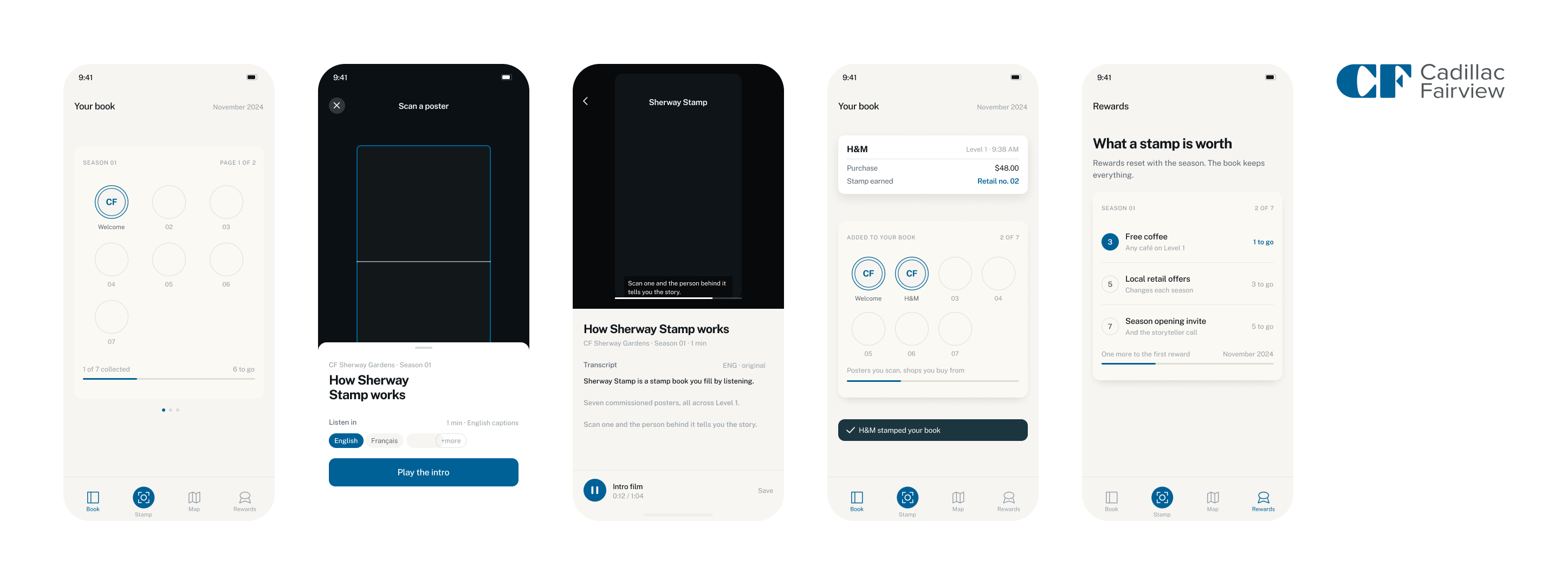
The book is the home, not the camera, so the app has a state to return to and the scan sits one tap away rather than as the landing screen.
Three marks open the first perk, and Level 1 receipts count themselves in without anyone scanning. Keeping retail in the same book as the poster stamps is what stops it feeling bolted on.
Events, and the walk there
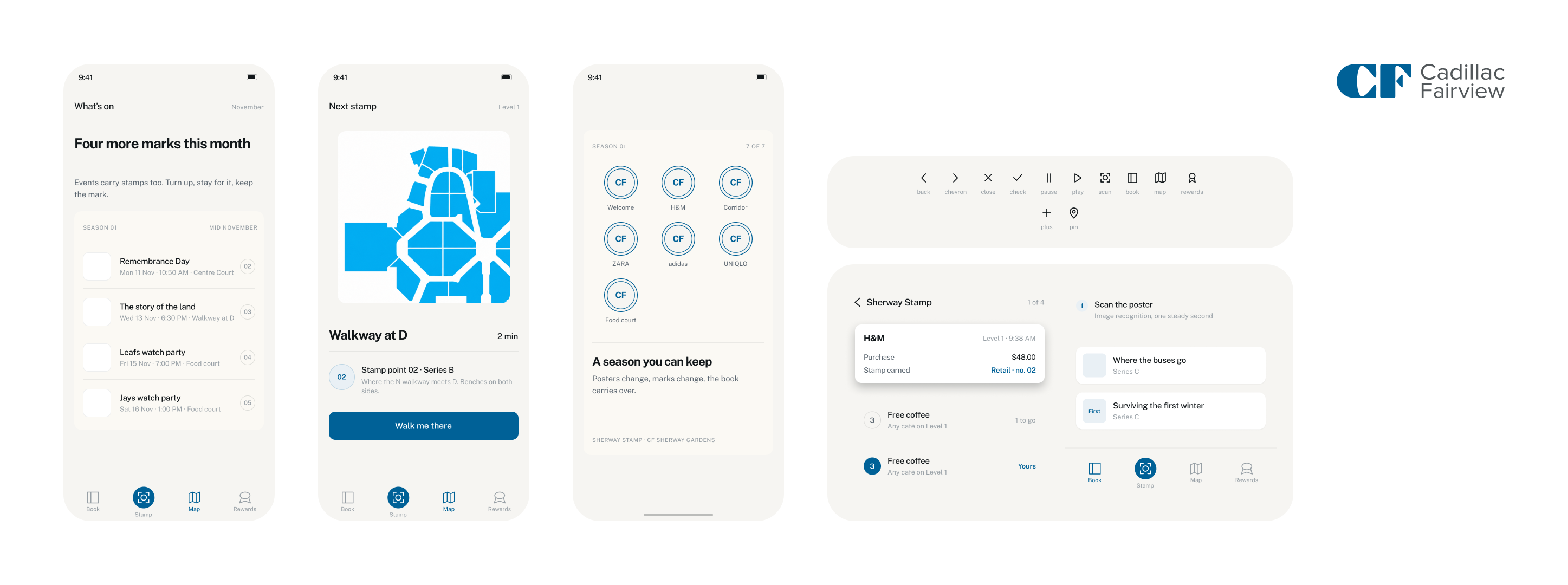
Events carry stamps the same way posters do, and a finished season becomes something you keep rather than something that resets.
Each event ends at a walking route rather than a room number, which answers the orientation problem directly.
How the direction got settled
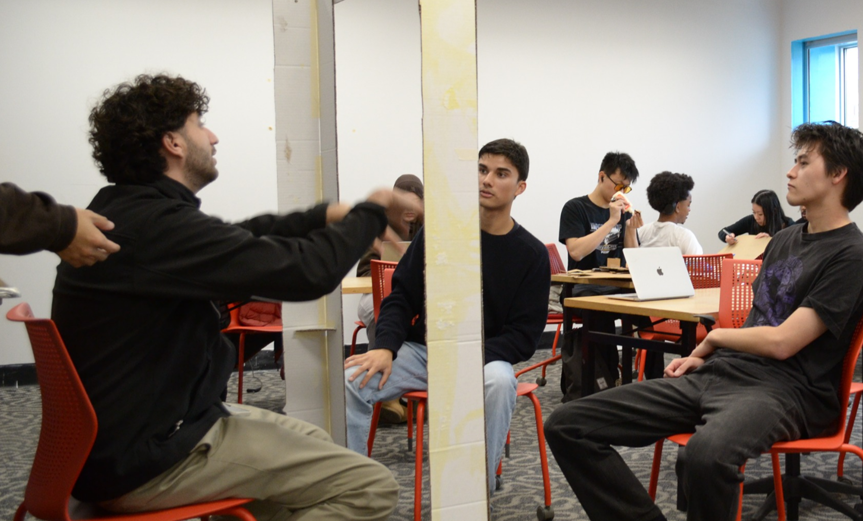
Five concepts, and the route to the one the team took forward.
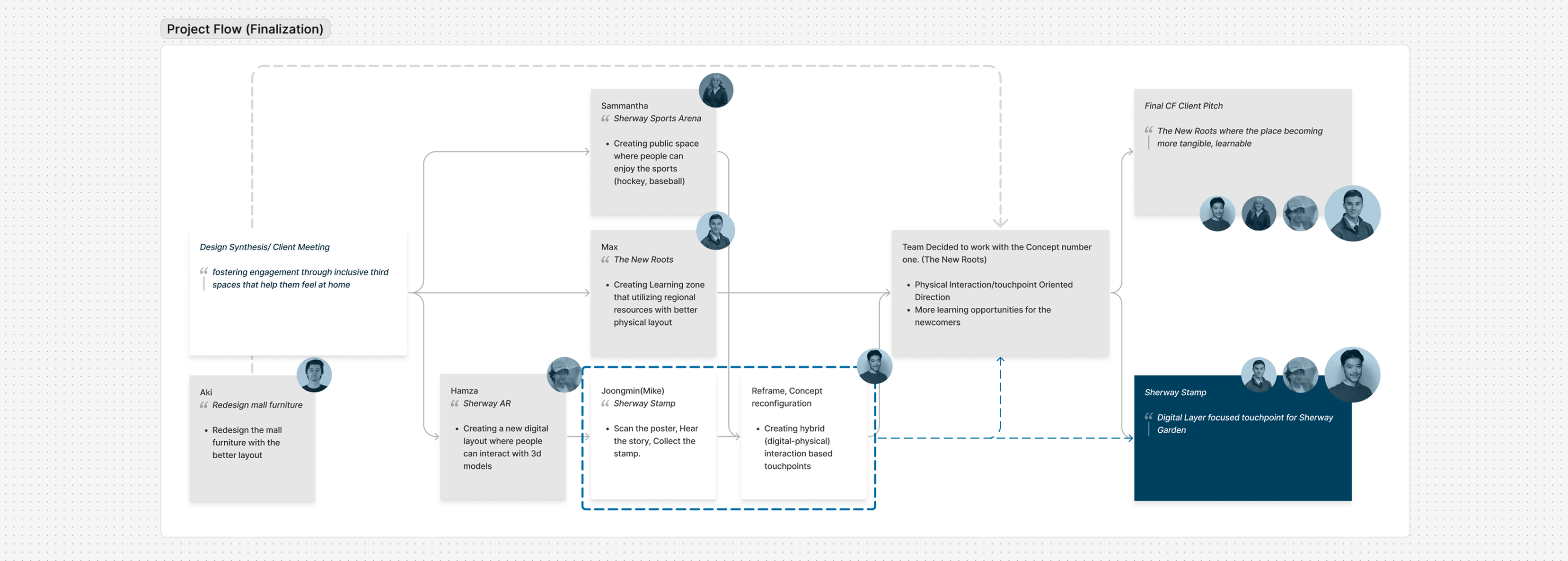
The team picked the concept the others could fold into, The New Roots, and that one was not mine. Mine came back at the reframe after the client pitch, as the digital half of a hybrid touchpoint, and Sherway Stamp is what that produced.
Conclusion
The useful move was refusing to treat this as a branding problem. Every observation we made was spatial, so the test became whether a proposal changes the room.
Sherway Stamp is not the direction my team confirmed at the end. The New Roots is, and Sherway Stamp was reorganised into a supporting function inside it. What it contributed was the skeleton of the digital experience and the basic interaction direction that confirmed concept builds on.
Two questions were left open: what makes someone scan in the first place, and whether the scan technology is shippable today rather than soon.
Sherway already runs plenty of events, and the potential programming is already there. The next problem is not adding more, it is retention, how you hold people across those programs and manage them as one thing.